An Advanced Course in PC Hardware: Choosing Components

8 01 2011

The first step in picking what components you want in your computer, whether you are building a custom setup, or buying one off the shelf, is looking at what software you expect to use.  I was looking for a rig that would work for Photoshop, AutoCAD, SketchUp, Thea Render (3D-Rendering Engine), and of course, games from time to time.  The next thing is to figure out what each one of these software packages rely on most heavily- Processor, RAM, or Graphics Card:

Photoshop: Here are the system requirements:

  • Intel® Pentium® 4 or AMD Athlon® 64 processor
  • 1GB of RAM
  • 1024×768 display (1280×800 recommended) with qualified hardware-accelerated OpenGL graphics card, 16-bit color, and 256MB of VRAM

The newer Photoshop versions make use of graphics cards more and more, but in bigger file sizes they also rely heavily on Processor and RAM.  The amount of layers, filters, and file sizes you normally work with will determine how much of either of these you need.  As I am looking to do plan graphics, printable high quality at 36″ x 48″, with many (40+) layers, I, in short, need a LOT of both RAM and Processor.

AutoCAD: The stated system requirements for 64-bit AutoCAD11 (2D) are:

  • AMD Athlon 64 with SSE2 technology, AMD Opteron® processor with SSE2 technology, Intel® Xeon® processor with Intel EM64T support and SSE2 technology, or Intel Pentium 4 with Intel EM64T support and SSE2 technology
  • 2 GB RAM
  • 2 GB free space for installation
  • 1,280 x 1,024 true color video display adapter 128 MB or greater, Microsoft® Direct3D®-capable workstation-class graphics card

First, you can run a PC at either 32-bit or 64-bit, 32-bit can only see up to 4 Gb of RAM.  Generally if you are building a new system you will go with 64-bit to increase the amount of RAM you can use now, or could upgrade to in the future.  None of these are amazing stats, but the RAM is slightly more powerful than the rest of the system- if all the components were equally important I would expect to see a Pentium 4 paired with 1 Gig of RAM and a 256 MB Graphics Card, or a P4 3.0 GHz (processor speed)/Dual Core Pentium 2.0GHz, 2 Gig RAM, 256 Meg Graphics Card.  This basically tells me that for 2D CAD the RAM is a bit more important than the Processor (which comes more into play with CAD’s modeling tools), and that while you need a Graphics Card, it does not need to be a great one by any means.

SketchUp: Recommended resources:

  • 2+ GHz processor.
  • 2+ GB RAM.
  • 3D class Video Card with 512+ MB of memory or higher. Please ensure that the video card driver supports OpenGL version 1.5 or higher and up to date.
    *SketchUp’s performance relies heavily the graphics card driver and it’s ability to support OpenGL 1.5 or higher. Historically, people have seen problems with Intel based cards with SketchUp. We don’t recommend using these graphics cards with SketchUp at this time.

While Processor and Graphics card are needed, RAM is the biggest limiting factor, in my experience, when you have large scale and or detailed models.

Thea Render: I could not find any system requirements, likely because the program is still in beta (testing phase), and while it currently only uses Processor and RAM, they are adding Graphics Card based rendering in a future update.

Games: For this I took the example of one of the newer PC games that has come out, and one that I wanted to be able to run at full bore- Civilization 5.

Minimum system requirements are:

  • Intel Core 2 Duo 1.8 GHz
  • 2 GB RAM
  • 256 MB nVidia or AMD Graphics Card

When running it with these specs on a laptop I could play it, but far from maximum settings.  The recommended settings are:

  • Quad Core 1.8 GHZ
  • 4 Gig RAM
  • 512 Graphics Card

Gaming is generally more Graphics Card intensive than productivity software, in part because the architecture of the graphics card is better at drawing faster – for better frame rates, while processors can do more math faster.  So in an enclosed system like a game where it is working with a small set of parameters, Graphics Cards shine.  But when you have many layers of images all affecting each other, the processor takes the lead back.

What am I left with after all this?  To get the best out of all my software, I need a good Processor, RAM, and Graphics Card- I can’t save on one to improve the others.  I also know I use a lot of this software more intensively than most, and I want to be future proof for a bit, so I need to exceed these system specs.  One place where I can save a little money now is in the RAM and Graphics Card.  That is because these are fairly easily upgradeable- with the right mother board you can add RAM to your existing RAM without replacing it.  Also, with the right Motherboard and Graphics Card, you can run in SLI or Crossfire – a method of tethering two Graphics Cards together in your system, and having them act like one, much more powerful card.  The nice thing both both of these is that you can spend, say $300 now on a Graphics Card, and in a year spend $200 on another card, and get nearly the same performance that you would have gotten by spending $700 now.

That being said these are the basic specifications for my new computer:

Processor- Intel Core i7 (Quad or 6 core) with a speed of at least 2.5 GHz and I want the ability to overclock in the future to upgrade slightly.

RAM – 6 Gig (Most motherboards can now handle in the range of 24-36! Talk about future proof!)

Graphics Card – 1 Gig at least, unsure of if I am going to go nVidia or AMD, it depends on the exact card (more later)

Hard Drive – 1TB I use some HUGE files (200 Megs for a single photoshop file), and I don’t want to worry about space for a while.  I may do a solid state boot drive down the road.

Optical Drive – DVD RW for sure, I probably don’t need a BluRay drive, as I could add one once burners get cheaper

Motherboard – Needs to fit my processor, and at least 2x my graphics card

Case – needs to fit everything, have great cooling, and have lots of room for additional Hard Drives, burners, and maybe even water cooling (if I overclock in the future).

Next time I’ll start looking at each individual item, and how I picked which to go with.

Ignoring the odd artifacting, this is what Civ 5 Looks like with the laptop:

And this is what it looks like with the new build:


Tuesday Tutorial: Between a Rock and a Mossy Place

20 07 2010

One of the fairly unique features of this site is the granite outcropping that runs along its eastern edge.  Giving a feature like this both realism and readability is something that requires multiple layers of textures, with manual manipulation required to give it an organic, natural feel.

I am again using a photo I took as the base for my granite material.  This is made more challenging due to the fact that the photo I am using only has a small area of solid granite, in the form of Belgian block edging.  I selected a few blocks that have similar tones, outlined in red, and used those as the base for my texture.

I used a mix of both healing brushes to fill in a large area using the existing blocks as a sample area.  First I filled in the gaps with the healing brush, then I used the spot healing brush to smooth the transitions between the original and the pasted-in areas.

I then repeat this process to slowly spread the area out further until I have a large area filled with granite texture.

This area I then use to create my base granite material by simply cropping out the non-granite area of the photo.  I also recommend looking for any obvious inconsistencies in the texture now, as you can use the healing brushes to eliminate them now.

You then simply use the same technique of pasting, fading, and cropping that has been used in the previous tutorials.

This texture is smooth enough that I am able to paste it into my image without needing a second layer of texture to mix it with, so for now simply add the texture into the drawing you have after creating a pattern.

While this granite outcropping now looks flat, although that will be helped with shading later in this series.  However, this is the more unique portion of this tutorial: to give this cliff some real depth and realism, it is time to add some north-facing moss.  First, Select a good moss pattern and fill a new layer with that pattern.  I selected one of the turf patterns as the moss layer, as it has about the right color, and has some good texture depth to it.
I then place this layer above my granite layer, and assign a new, empty layer as a mask.  I then re-select just the area filled with the granite.

You then want to select a brush with… for lack of a better description coming to mind, a spread, clumping form.  I used a dual brush with medium scatter and a low count, as this gives you a good random spread, while keeping the brush in proximity to the cursor.  (The dual brush essentially assigns a masking brush to another brush, so you can have one brush with a monster spread that would go to every corner of your canvas, but then you mask it with a 100 pixel wide round brush, so the only area the first brush will affect is the area also covered by the non-spreading brush.)

Then paint what would be the north facing areas of the slope on the masking layer, with the most paint going on the most north-facing areas.

This will start to give a nice additional level of depth to the image, especially once the shading is added later on.

Next time We will tackle the longer grasses that surround the house.


Tuesday Tutorial: Time to get your hands dirty

25 05 2010

Dirt is one material that, while rarely fully exposed, is often a base material that other elements are placed over.  Many times these elements will have gaps between them where there is exposed dirt, whether it be in a mulch-less planting bed, or in areas like a dense forest as we have here.  You cold also combine the dirt with another layer of material, like a scattered moss or leaf-litter, to add some depth and realism.  I have used this in 3D models before with good results, but in a 2D rendering it can add slightly more detail than is useful, creating a cluttered look that makes the drawing a little harder to read.


The first process for making dirt is essentially identical to how you make turf.  However, the images I selected for this tutorial have some major imperfections that will allow me to show one of the powerful tools in the Photoshop box: spot heal.


You can see here that the first image I am using, from a residential lot, has a large pipe with a string attached that sits in an area that otherwise I would want to use.  I could give up, and use a different image, or only use a small section.  I did not take the photos intending on using them for this purpose, and therefore only had a few, and I also was only using a small piece from my second image due to the angle and size of the bluestone patio in the image.

As I need some flexibility in size to reduce the tiled look, I opted for the slightly more challenging method of healing the pole and string out of the image.  First, however, I adjusted the perspective of the image to minimize scale changes throughout the dirt.

Once I did that, I was able to use my heal brush to remove the pole from the image.  In an image such as this, it involves a relatively simple process.  First, select the spot heal tool from the main drawing toolbar.

For an image such as this, its best to use the spot heal tool instead of the heal tool.  Heal is better when large areas need to be covered using techniques I will cover later in the series.  The spot heal tool works by essentially blurring the area.  To demonstrate the basic idea, I created a colored grid.

I then used the spot heal tool on the path seen in purple:

This is the result:

So by using this tool, and painting over the pipe and string, you are able to essentially eliminate them from the drawing with very little work, and you now have a much larger area to pull your texture from.

Next you have to pull an area out to use as your pattern.

As you can see, there are some areas in the bottom of the drawing that are much lighter than the rest of the dirt, so you should again use a burn layer and around 8-9% opacity black to paint the areas darker.

This light amount of paint evens out the textures greatly, giving a pattern that will look fairly uniform on its own.

Once you have that, it’s the same method of setting up two buffer areas with guidelines, copying them, erasing them, and then cropping the image down to creating tiles without hard edges.

This material looks pretty good, but when rendered it will likely look a little to cool and dark, almost like rough asphalt.  By shifting the image’s saturation, you can get an image that it warmer and a bit lighter.

I took the same steps with the second image, giving me a second, smaller texture that is equal in quality to the first.

By layering these images in the same way as I did with the turf textures, and with the same masking layer pattern, you get a seamless topsoil layer.

Next week, we will tackle the granite outcropping on the west of the site.


Tuesday Tutorial: Turf, and basic techniques

18 05 2010

As it is with many things, my technique for turf, and the similar techniques I use for other materials, were born of other needs.  Namely, I hated the way my turf looked in 3D renderings.  You could use a created texture, but it never looked organic.  You could use a photo, but you got TERRIBLE tiling effects.  You could do a slight color overlay to soften the impact of the tiling, but the color was always off, and you would lose to much of the internal texture.  I tried all of these, before scouring through tutorial sites and stumbled on the idea of using two separate textures, with a masking layer to blend the two.  This is used commonly in 3D models when you have to put a non-square image onto a model.

Say you have a beer… sorry I got distracted there for a second.  So, you have a bottle shaped model, and you want it to be beer.  The first thing you will do might be to fill the bottle with liquid, and make the material into tinted glass.  You then have a very pretty blank beer bottle.  It needs a label to look right.  Many beer labels are not square, but no matter what the image you import onto the model will be square.  You handle this by making two images.  One is the image you want shown, the other is a mask, like we make for the hand drawn lines- with what you want shown in white, and what you want to have invisible in black.  Now, you normally just place a single image, so you get one label.  But there is no reason you couldn’t tile the material so it would repeat hundreds of times over an open field. And there is no reason this technique cannot be used in photoshop to make detailed, photograph based textured that don’t show any tiling.

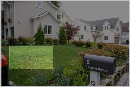
The best way to get good, organic texture, and realistic color, is by using photos.  These can be photos you took expressly for texturing, or everyday photos that have a good amount of the material you are looking for.  The best option is images takes specifically for texturing, as you can take a picture that will be fairly evenly lit, and taken from above, reducing the amount of perspective in the image.  For this tutorial I am using two photos I took of a small residential project I designed last summer:

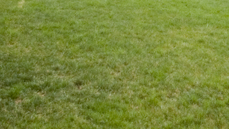
The first thing you do is crop the non-grass areas out of the image, so you have a decent base to work off of.

This gives you a clear area of turf to work with.  Having other distracting elements removed from the photo also allows you to see inconsistencies in color.  These inconsistencies will show clearly when tiled.

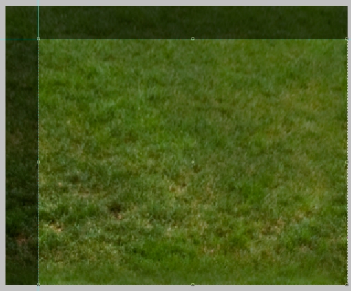
Looking at the image, you can see how much lighter and smaller the blades of grass are on the top and right of the image.  By cropping those areas out you easily eliminate some trouble spots without resorting to the slower techniques next.

There is still a darker area to the left of the image.  The way I will address that is by adding a second layer above the turf image.

By setting the layer to linear burn, and using a round, soft brush, set to black, with around 8% opacity, you are able to paint the image slightly darker in the areas that need it to even out the over all texture.  By using linear burn you darken the tone of the image without adding gray to it, muting the color and texture.

That is all the paint I needed to lay down to change the texture to this:

The image is a little more flat then i would like, so next I increased the contrast to give more sharpness to the texture itself.

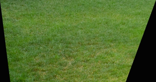
As you can see, much of this process is trial and error- looking until you see a problem, fixing it, then looking for the next problem.  After doing all these adjustments, I noticed that the perspective makes the foreground far more coarse than the top of frame.  To fix this, I used Edit->Transform->Perspective to both shrink the foreground.

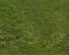
Once cropped, you have a nice smooth texture that still has a realistic amount of character.

This seems like a fairly regular texture, with a good amount of color, so its time to make the image tile without a hard edge that will always show clearly.  The first step is to lay some guidelines around 1/10th of the way from the edges.

Select the areas between the edge and the guidelines and the outer edge, and copy it on a new layer to the opposite side.  This makes it so you have a smooth transition from the left side to the right, with no edge.

You will still have hard edges where the new layer hits the old, but you can now make a transition between the two.  For this tutorial I used the most basic method, with is to use a soft eraser to fade the transition layer from the edge in.

Now by cropping down the image to where you have the guidelines you will make a tile that will not have a hard edge.

Now with a smother transition, preventing a hard edge your ready to make a pattern.  Hit Ctrl+A to select all, then go to Edit->Define Pattern and name your new pattern (Something like Turf Layer 1V1.0) and save the image in a folder- mine are saved to the desktop->Render Patterns->Turf->Turf1V10.jpg.

This way you can back up all our render patterns, and move them to other computers just by opening the image, and defining the pattern again.  Now give your new pattern a shot, using it to fill the turf areas in whatever rendering you are working on.

Now you repeat the same steps with the second image.

Crop

Burn

Perspective (correct for off-center image here as well)

Crop and increase contrast, copy edges and erase to eliminate straight edges

This is a key point in the creation of your second pattern. To make an organic, non-repeating pattern, you must make sure the two final patterns sizes will not allow them to line up often, creating a repeating overlap.  You do this by looking first at the size of your first pattern.  My layer one is 280×224.  That means you will have an edge (left to right) at 0,280,560,840,1120,1400 etc, and (top to bottom) at 0,224,448,672,896,1120 etc.  You want to pick sizes for your second layer that will not line up with those.  I resized mine to 600×415.  That means that left to right my two tiles will not repeat until 4200, and top to bottom until 92960.

Once you resize your pattern, save it and make it into a pattern just as you did with layer 1. And paste it as a second layer in the same rendering.

The last step is to create a clipping layer, which acts basically like a masking layer, for the grass layers that will allow the two patterns to mix. First pick a noisy, random pattern brush.

Then go into the settings for the brush, and max out the size jitter, and turn off the brush presets other than Shape Dynamics, Scattering, and Smoothing.

Then turn up the scattering, and turn the count as low as you can.

Now make a new image, and make a second layer in the image.  Make a scattered spray of black over the second layer, getting fairly even, but random coverage, then turn off the background layer.

Use the same method of Guidelines, Copy, Erase to reduce edges, than use the same idea as above to resize the image to reduce overlap of the edges.  Last save the image as a PSD (to preserve transparency), and with the background layer off, make the image into a pattern (Turf Mask v1.0).  Spray the mask into the same area as you had the turf, into a new layer.

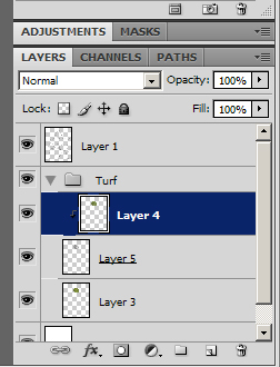
Put all the layers into a Turf folder in Photoshop, with the mask sandwiched between the two turf pattern layers.

Now select the top-most turf layer, and click on Layer->Create Clipping Mask

This will tell the selected layer to be masked by the layer behind it.  This mask is not based on Black Vs. White, but opacity, which is why you had to make the background transparent for your masking pattern.

This finally gives you the final results you have been looking for:

A smooth, lineless, textured, natural colored pattern.  You can also look at the overall image here, and – using hue-saturation/contrast – tweak the colors until it looks a little better (This seems a tad brown and muted to me).  Write down what tweaks you made, reopen the saved patterns you made, and make the same tweaks, save the version 2.0 of each, and re-define the patterns as well.

These two patterns don’t seem like they would work together with the different darkness levels, but they are what gives you the following results:

While this process is time consuming and a pain, the key is to remember that from now on, all you have to do is paint an area with three patterns, make one a clipping mask, and your done.

Tune in next week for the next key landscape building block: dirt.


Tuesday Tutorial Re-boot: To line or not to line

11 05 2010

When starting a digital rendering, just like with a hand rendering, the first step is always to create the lines you are going to render within.  Generally people use lines directly taken from AutoCAD for digital renderings as these are the “cleanest” lines, and allow for some shortcuts such as exporting each area as its own file.

This method, which I have used often, involves turning every layer off except 2 – one framing the layout window, and one with a single rendered material (turf, pool edging, brick patio, etc.) You repeat this with every material, then bring them into Photoshop, and create a single drawing with the different areas as layers.  The advantage is that you then can use the magic wand to select even the most complex shape in a single click, regardless of how it will intersect other layers.

The end product is a clean rendering that has good line-weight, and reads easily.  The problem is you also have a drawing that has perfectly straight black lines, which add neither realism or soul to the rendering.

The second method is to forgo lines altogether.  Use the method described above, but turn all the cad layers off before saving (and make sure you selected both the area inside the lines, and the lines themselves to insure there are no gaps in your rendering).  This moves you a step more natural, as you have slightly blurred edges between materials, making a more aerial-photographic look to the rendering.  This may serve well in certain presentation settings (when trying to show the design blending in with existing conditions for instance), but the lack of hard lines, and of line-weight, greatly reduce the readability of the design.

In general, I prefer a third method that is less efficient, but gives – in my opinion – far better results than either of the other methods.  This involves printing out your full design, doing the line-work by hand, and then scanning it in to render from.  This involves a few levels of added difficulty, as to have a single person render they need to be equally skilled with Photoshop and a pen, a large-scale scanner is nearly a must, and there is another time-consuming step added to the process.   The added style, in terms of having a drawing that reads well AND has soul, more than outweighs the challenges in my book.

I said a large-scale scanner is nearly a must because it can be done with a traditional 8.5 x 11 scanner, but the line work must be far more precise, and line-weights are much harder to balance at a small-scale.  (I am using a small scanner for this project, and a .1 with a straightedge is significantly thinner than a .05 freehand drawing lines less than half an inch in length.)  Some of this may be due to the fact that I am slightly out of practice on my hand rendering, but some is also the difficulty of small-scale work.

One thing I like to do to simplify the process is to first draw the ground plane with just material borders, scan that, and then fill in any detail (line hatching for decks/paving if desired, or, in this drawing, the flagstones), and rescan the whole drawing.

This has two main advantages.  First, it allows you to still color as a block, and then add the detail later, when it doesn’t slow the rest of your work.  Second, it allows you to tweak the line-weight on those detail lines.  This may play a role even when working with a large format scanner, but it is a lifesaver when working small format.

This way you can, after cleaning up the scans and making the white areas transparent, you can delete the outer edges of the detailed scan’s lines, reducing the line-weight, and increasing readability.

One of the tricky parts of this process is how to make the black lines the only thing on a layer, so you can render behind it and have the black lines not edges with a light gray halo.  The first way you can do it is by selecting the white areas, deleting them, and darkening the other areas.  This can often lead to white/gray artifacts in the black lines.  The better way is to use masks/alpha layers.  First we have the scanned image:

The first thing that needs to be done is cleaning up the white areas.  The easiest way to do this, along with darkening the lines, is by increasing the contrast of the image.

Once you have a sharp black line on white, go to Image->adjustment->invert.  this will give you a negative image, with what was black white, and what was white black.  Then go to Image->Adjustment->Hue/Saturation and desaturate the image.

This step is necessary to make it into a masking layer, and it also allows you to more easily see areas where the black lines (now white) are slightly gray and transparent.  You can now tell if you need to up the contrast even more.  Then make an additional layer of solid black.  Open the masks window by going to Windows->Masks, and click on the icon for “Add a Pixel Mask”.

Select your inverted layer, Hit CTRL+A to select all, and CTRL+C to copy the image.  Then select your black layer that now has a masking image (Shown with a white box in the Layers palette).  The way to paste info into you mask layer is by clicking on the Channels tab of the layers palette.  At the bottom of the list you will see a layer that is not active and is pure white.  Turn on and select the layer, then hit CTRL+V to paste your image data.

By turning off the masking/alpha layer, you now have a layer that is pure black with transparency for your textures to shine through.

The only remaining thing is that if you do need to edit the layer, you don’t edit the black layer, you go into the channels, turn off the RGB layers, and turn on the masking layer.

Then you edit this layer.  So if you need to delete a line, delete it here, or paint over it in black here.  This is also where you will thin your detail lines if you need to create more line-weight.  The easiest way to do this is by using the magic wand with “contiguous” unchecked.  Then go to Select->Modify->Expand.  A little trial and error is needed here to find the right amount to reduce the line-weight without erasing them.  Once you have the right amount of expansion, make sure black is your background color, and hit delete to reduce the line-weight.  If you’re my method of a main line layer and a detail line layer, each will be set up this way, in one folder on the top of the layer stack.

Next time I’ll go over turf, and give the technique I use to erase the tiled look patterns normally create.


Tutorial Tuesday- Reluanching May 11th with this gem!

4 05 2010

After about a week and a half of fine tuning techniques, taking tens of photos for reference use, and taking hundreds of screen shots, my relaunch of Tutorial Tuesday is imminent.  This time, I am adding a twist to the formula.  Last year, I came up with the idea of doing the tutorials based on a single project, and walking you through my process.  This started with my SketchUp models.  Unfortunately, soon after I began making the project model, intended to be a base for a new website, I decided to go in a different direction.  However, starting next week, you will get a step by step walk-through of how I went from this:

to THIS:

As always, I am looking for feedback not only on my method of tutorials, but also the content and end results of my methods.  I am making these tutorials so people will have the jumping off point that I never had.  I want people to find new techniques, grow what I do.  I have spent countless hours growing these methods, all I ask from you in return is that you spend a few hours developing ways to improve these techniques, and let me, and the other readers, know what you did.

With that, I’ll see you next week!


Fresh Start on Rendering Techniques

2 04 2010

Last summer I started blogging tutorials on my new rendering methods in the hopes that it would A) help people looking to do Photoshop plan renderings a starting point to work from, B) cultivate some conversation on other people’s techniques, C) show how much work goes into any given rendering.  This was (I hope) successful on at least the first and last count.  However, the conversation I was looking for never really started… except in my own head.  As I finished my Master’s thesis at the end of 2009, I had to render some additional views of my 3D Studio Max model, and realized how unhappy I was with the textures I had used previously.  Colors were over-saturated, tiling artifacts were fairly obvious, and everything just looked off to me.

That lead to some experimenting with different methods of doing things.  I had started to play around with using images for my textures some while still writing my original tutorial series.  I had mixed the photo with color overlays to soften the image and give it more of the tonal quality I had been looking for:

While this solved SOME of the problems with my original method, it still relied heavily on my own eye for color selection. I know this is not my strongest skill when it comes to trying to think of something like: what color is grass, overall, REALLY.  I can describe it perfectly well, but when it comes to picking the right color in Photoshop, I just seem to get lost in the sea of options sometimes.  It also does not solve the problem of repeating texture tiles.

My latest iteration involves not just an image with a color overlay, but two images tiled at different scales and a clipping layer (which deletes portions of the upper layer) with a pattern that tiles on yet a different scale.  This creates a photo-realistic texture that is accurate in color, and is virtually tile free.

(Note: Please pay attention to the turf areas- I never re-textured the other areas )

This method is what I will focus on for my next set of tutorials.  I also am going to set these tutorials up in a slightly different way.  I have a residential project that I worked on in school that was made completely in model- no plans whatsoever.  I always wanted to go back and create a rendering for the project as I was very happy with both my design and my model.  So, as part of my impending website redesign I am going to go back and, from model photos and the original site survey, create a plan for the design, that I will then render in photoshop.  The stages of this rendering will become the different tutorials- Turf, Gravel, Slate, Water, Native Grasses, Shrubs, Roofing, Woods, Cars, and Dirt.  Some things will be made by scratch, some will be textures.

So, once I have the base drawn and start getting to work on this rendering, you will be the first to know- by way of NEW TUTORIALS!


What do YOU want to know?

14 11 2009

Sorry for the break in my posting schedule, After the ASLA conference I was in bunker-mode finishing my thesis project, which I successfully defended at the end of October!  So, now that I only have a few edits left before publishing, I am going to get back into the groove.  The thing I am wondering is, what do you want to see posts about?  I have tweaked my photoshop rendering methods based on my 3D Studio Max work, so do you want to see more posts about plan renders? or are you more curious about how to bring that SketchUp model into 3DS Max to punch it up?  Maybe you wonder what type of tech might be helpful for your firm, or want more insight on how it works?  Or do you just want to see what video games I, as a member of the creative field, find to be a good creative outlit/muse.  Let me know, and feel free to suggest other ideas.

I’ll be back soon with a post just as soon as I revise some thesis text…


Time Out…

28 07 2009

Due to some circumstances revolving around my current employment situation, I am taking a few weeks off of the Tuesday tutorial while some stuff gets sorted out.  I have a few traditional posts on the burner, as well as a plan to shift to some 3D rendering tutorials for a bit, but I need to take care of some things before I can drop the needed time into them.

In the mean time, please take a look at my old tutorials, use them, abuse them, change them, and let me know what you come up with.  What I have on here is what I was able to create based off tutorials for making websites, and heavily torquing them to fit the needs of an LA.  I dropped a good amount of time getting these techniques to where they are, and I have no doubt there are ways to make them better, so consider this a call to open up some dialogue:

How would you change my tutorial to make it go from mediocre to awesome?


Tuesday Tutorial: Wood Decks

15 07 2009

One of the things that most people can get to look pretty decent, but not great, is wood decking.  Unlike wetlands its not one of those things that, when done wrong, looks like something fundamentally different, but being able to create a deck that really shines without spending a ton of time on it really can make a great touch.

Step 1:Paint Outside the Lines

This is a very familiar step, select and area larger then the deck itself.  You need the extra room to allow for some of the filters to work without screwing up the edges of the deck.  Next, pick a color for the decking- I went with R: 129 G: 87 B: 60.  Its got a little orange to it, but its not highly saturated.  This color will essentially be the mid-tone for the deck, so make it what you want the average color to be.

BrownColorTone

Then fill the large area you selected (On a new layer) with the brown color.

BrownBlock

Step 2: Adding Grain

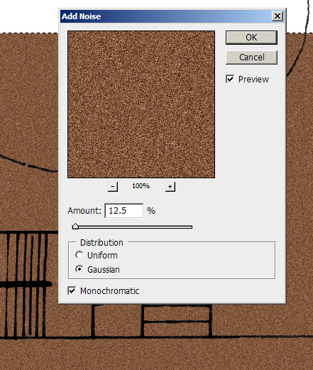
To get a nice wood grain for your decking boards, start off by adding noise.  You want to use monochromatic to keep the noise to shades of brown, and I prefer using gaussian because it seems to give a less regular, boring look.  I used 12.5% for the amount of noise, but it will vary some based on the scale of the rendering.

AddingNoise

Next, you want to add motion blur to the grain to turn it into strips of color.  You want to pick the same angle for the motion blur that you want to use for the boards- I’m using 45 degrees as it looks good, but also makes life easier when it comes to making the stripes.  As for the distance of the motion blur, I used 66 pixels because it made any color stripe about 5 feet long in the plan, which gives it some good variation.

motionBlur

Step 3: Add Some Character

The last step for the wood grain is adding knots, imperfections, and character to the wood grain.  For this I used Filters>Distort>Ocean Ripple.  I went with a setting of 2 for both magnitude and size, but it, again, comes down to finding a setting that looks good based on your scale.  You want to have some knots in the wood, but you still want long segments of fairly straight color.

oceanripple

Then trim away any excess from outside, and you have your decking base.

TrimmedBrown

Step 4: On The Board Walk

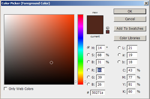
The first step to adding boards to your deck is to create a pattern.  First, pick a color that is a darker shade of brown.  The tone can be a little more red, as you are looking down through the gaps to dirt/shadow, and you don’t want the board gaps to just look like another large straight wood grain line.  I went with R: 80 G: 39 B: 26.

StripeColorTone

Now you want to make 45 degree angled stripes.  Use the line tool, with a width of around 2 pixels.  Then click the mouse to start a line, and push and hold shift- this will lock you into a line that is either 0, 45, or 90 degrees.  That way you know that you have exactly a 45 degree angle.  Then, draw a second line the same way.  To make a pattern you will need at least 3 lines, so now merge the two layers of lines, and copy paste them.  You should be able to move the new layer to the side until one of the lines perfectly overlaps one of the original lines, giving you three.  If you used this alone as a pattern, the anti-aliasing would be screwed up from the double layering of one of the lines, so delete the doubled up line from the pasted layer, and you will have 3 diagonal lines (I went one step too far, and did 4 using the same method a second time).

Stripes

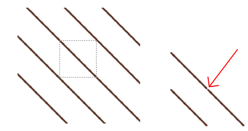
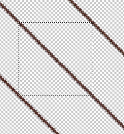
Now to select an area to make the pattern from, merge the line layers together, and turn off any other layers.  Using the rectangular selection tool, click on one of the squares in the center of the middle line, and again, hold shift as you drag it down, locking it to moving at a 45 degree angle, creating a square.  You might be tempted to drag it down until its just outside of the two side-lines, but that will give you a strange gap in your pattern, as the repeating tile will not have the full width of the line:

patterngap

So make sure that you get part of the line, essentially all of the line other then the single pixel that is grabbed in the upper left and lower right of the selection box:

StripeSelection

As you have before, go to Edit>Define Pattern and give the line a name, like “Decking” or something of that ilk.  Its key that you have all layers other then the line turned off so you have the lines on the transparency grid, or when you paint with the pattern your wood grain will be covered.  Once the pattern is made, magic wand select the area not on the deck, then invert selection, and paint the decking pattern:

StripedDeck

Step 5: Shading and Shadow

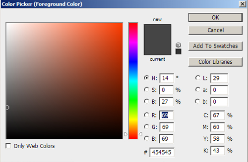
To give the decking a good three dimensional quality, you need to add shading for stairs and decking.  First, pick a dark gray color, like R:69 G:69 B:69.

ShadowColor

Then pick a brush that you will use for the railing shadows- I’m using 15 pixel, 0% hardness, 27% opacity.  Turn the mode to “Linear Burn” or “Color Burn”.  These both darken the color, without graying it out, like an actual shadow.

ShadowSelect

Start with any straight railings.  Click the brush where you want to start a railing, push and hold shift, then click where you want the railing to end.  this will give you a straight line with your brush.

BaseShadow

Then add in any shadows that should be angled- Supports to the main railing, and for railings along stairs, the railing is at a vertical angle, so the shadow will be at an angle.  The shadow will get closer to the railing as you move down the stairs, but each step will set the railing back to its original distance, so you end with a jagged look like this:

RailingShadows

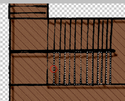
The last touch is to add shading to the decking where it would be cast from changes in elevation of the decking.  Increase the size of your brush by around 2x.  Now, select every other stair that will have a shadow cast on it:

stairselection

Now use the same Click-Shift-Click method to paint on shadows.  The trick is, run the brush so the middle of it runs along the uphill side of the selection box:

stairpainting

Once you do it for the selected stairs, pick the ones you skipped in the last selection and do it again.

Shadow

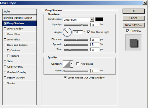
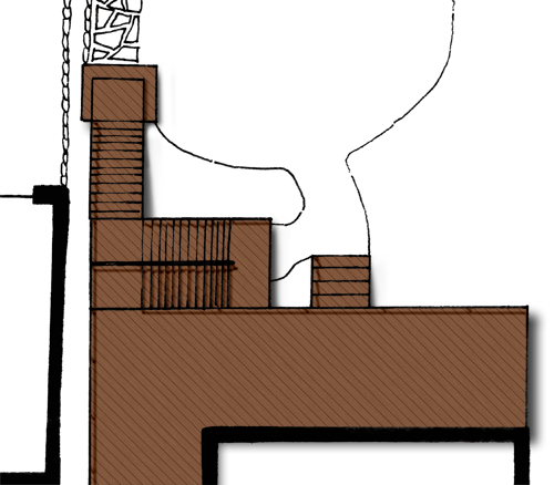
Now, to create the shadow of the deck onto the ground, you could simply to a drop shadow to the layer.  However, that will leave you with the top of the deck making as much of a shadow as a stair that steps out onto the lawn, which again breaks the three dimensional illusion.  The create a shadow that has depth, first, make a standard layer drop shadow, again with linear burn as its mode (Note: you will not be able to see the shadow until you turn on a layer behind it, so turn on the white background layer):

dropshadow

In the layer pallet, right click on the drop shadow you just made, and select “make layer”.  A pop-up will ask if you really want to, and yes, you do.  You will then have an editable drop shadow.  Take your eraser and a nice 0% hard brush, and start deleting parts of the shadow to make the stairs angled and the low areas shorter then the tall areas:

Tweakeddrop

Turn down the drop shadow layer’s opacity to around 65%, and you are all set:

Final