Open Internet FCC Comment

16 07 2014

In honor of the fact that the FCC had to extend the deadline for comment on net neutrality/ Open Internet because their servers got hammered, below is the comment I sent in. There is still time, send your comment via e-mail to openinternet@fcc.gov until Midnight Friday the 18th.

First, make no mistake, there is no such thing as a “Fast Lane” on the internet.  Senator Ted Stevens was wrong, the internet is not a series of tubes. What Verizon, Time Warner, etc want to do is to artificially limit the ability of the populous to distribute their intellectual property based on whether they can pay a fee.  And this fee wouldn’t, like toll bridges, go to create faster infrastructure that, in theory, would one day be opened to the public after being paid for.  This fee would line the pockets of the companies that run them. Don’t call the paid tier a “fast lane”, say what it is, speed throttling for everyone else.

(For clarity of purpose I won’t REALLY get into the whole fact that someone in your office should CLEARLY be bringing collusion charges against cable companies, given that the CEO of one of the companies argued that a merger didn’t hurt competition because the two companies were not competitors because they agreed not to overlap regions…)

Instead of restricting flow, do what the US should have been doing during this entire economic downturn, and investing in our infrastructure. Create jobs by re-building bridges, renovating our schools, and installing fiber optic line under every interstate highway.  It would cost money, but would give thousands of engineers, architects, landscape architects, IT professionals, and construction workers jobs now, reduce pollution, increase quality of life, and . By giving true high speed internet access to rural communities telecommuting becomes a realistic option for millions more people, which could reduce some people’s commutes from 5 days a week to 1 or two days.  People could buy houses and live where they want, and can afford, not be stuck renting in a place too expensive because it’s closer to work.

Our current communication system is part of what is holding the US back in technology, science, and math.  Letting Verizon or AT&T charge Netflix more for faster movie streaming will not help that, if anything it will hurt it more.  Why, as an upstart 16 year old, should I really dive into computer programming if I know that there is no way I can make my idea for the next social network work because it will be stuck behind a speed throttling wall.

What makes the internet so powerful, and so inspirational, is the fact that it is a 100% open market.  Most things online are free. Nerdist.com has become a mainstay on the internet at this point, hosting tens of podcasts, video shows, and has led to some TV shows.  The founder, Chris Hardwick, has talked about how he started the site as a blog because he thought he could talk about the stuff he liked better then the way it was being covered, and that he always planned that it would be bigger than himself- he would have specialist writers/hosts for different types of information. If he has known that after founding the site, he would soon hit a wall where other sites would become more attractive because his bandwidth was being throttled but that he might not be able to get the revenue to upgrade because of the throttling, do you think he still would have put everything he did into that site?  He probably would have played it safe, and done some great work, but not sunk his heart and soul into it. It would have prevented the creation of a site that has given people jobs directly, and indirectly by inspiring people to go out and work on their passions.

The internet is great because it allows people to put their passion forward for free. To see where they stand with an investment of time alone, and get a true vision of where they stand.  And to be in a community that embraces the competition.  When I started working on developing rendering skills in photoshop for Landscape Architecture, I didn’t sock them away; I went online and not only shared the results but wrote tutorials on how I did what I did. All in the hopes that someone would see it, learn it, figure out some new tricks and get even better than I was. Maybe I would then see what they did in a magazine, and would be able to figure out how they did it.  This circular feedback loop that is so much of the internet could be destroyed by throttling.  The rendering techniques I learned helped get me the job I had before my current one, and the one I have today.  Throttling would pull that rug out from under our feet.


Cosmos- Must Watch TV.

9 03 2014

I would say I’m stupidly excited for Cosmos tonight. But watching it may be the smartest thing you can do. If you love science, watch for enjoyment. If you are skeptical of science due to religious beliefs, watch to see what wonders you are missing out on. I often see religious believers asking atheists what there is to live for, what makes things beautiful if there is no meaning. Watch Neil DeGrasse Tyson talk about science for 5 minutes, and it will be clear that to a scientist, nothing could be more beautiful than a universe created by physics, mathematics, and chance.

If that doesn’t make you want to watch, watch for the fact that an understanding and love of science is what will make our civilization thrive. We will run out of fossil fuels. We will encounter other asteroids like the one that hit Russia last year. We will face issues that we currently have no ability to solve. Without a generation that is passionate about science, we will be doomed by ourselves, if not by out interstellar neighbors.

Then, after you watch, DO SOMETHING. Vote for someone who loves science, not someone who tries to mute it in our schools. Recycle and buy reusable shopping bags. Buy a telescope. Plant a garden instead of lawn. There are literally endless things you can do that will improve the world.

“What happens in the first second of the next cosmic year depends on what we do, here and now, with our intelligence, and our knowledge, of the Cosmos.”- Carl Sagan


Design Studio: Project 1, Episode 2

11 04 2011

Now that I have a site and a client, the first thing to do is to walk the site, and create a site analysis based on what the client needs and what the site and borrowed landscape provides.  My first cut at the site analysis stayed at a large scale and was somewhat bold.

This analysis was made with Sharpies on a trace sheet laid over the base map, and serves as a first step to get the big issues onto the page.  I then stepped down to a more detailed analysis using a wacom tablet on my PC.  This allowed me to work on top of both the base map, satellite photo, and my first analysis map, all with variable opacity, while still having the control/feel of a pen.

This analysis map is what I used for my conceptual design phase on a site scale.    This would still be for internal use in general, and would be supplemented by fine detail analysis maps if needed.  The text is also a good indicator of my current skill with a tablet, as I do not have the best handwriting, but the wacom only makes it look worse at this point.

Now that I have a working analysis map, I’m going to work on programming of the site, and conceptual designs.  The program I came up with preliminarily was to have a large space for entertaining that would also function as a semi-public space, like traditional shared backyards. In most of the concepts I also looked at more of a private outdoor space, both as more of a contemplative area, and as an area for small gatherings/date nights.  I wanted to include a small garden for both vegetable and herbs for cooking, and at least one turf area for any future kids/dogs.  I also wanted to make sure I included an area for infiltration and slowing of any flooding behind the garage. Once I had these basic building blocks, I started the conceptual phase with a method one of my professors was a huge fan of: 10 conceptual designs in 10 minutes.  Admittedly, I took more like 20 minutes, but I still got good results.

This method forces you to rethink ideas you already had in your mind.  To come up with 10 distinct ideas in a short amount of time you are forced to think about things in new, and a more instinctual way.  Also, after five or six conservative concepts, its gets easier to go nuts and do something a little more off the wall.  I took these concepts, and decided I wanted to explore the idea of a raised deck as the private space in the rear (from Concept 4), and the idea of a deck with planters built in for shading and easy herb access (Concept 5).  I also wanted to look into making the “party parking” into grass-pavers, which would increase my usable turf space greatly in the narrow yard.

On a technology side-note: I was somewhat surprised with how well the Wacom worked for this process.  In some ways I had no real hope for it replication the  experience of pen on paper, but it actually did a good job.  There are some drawbacks- fine pen control is tougher and requires another level of hand-eye coordination that even my gaming-trained mind does not quite have, and unless you buy an expensive model, you are drawing on a smallish 5″x8″ area instead of a sheet of trace the size of your table.  However, there are some benefits as well.  You can easily make a pallet of pen colors based on what the program is, and have more options than Sharpies would give you, with quicker color switches.  You can also either draw everything on one layer, or each part on a different layer, so if you like one part of a concept, you can just edit other layers, leaving you favorite untouched.  You also have the power of a perfect eraser and undo, so anytime you draw a bad line, with a single click it is completely gone.


Back to the design, I then pulled the two pieces I liked into a single file, giving me an idea of roughly what the two part would look like.  I then started by rough blocking the rear deck and the infiltration area in the rear, before moving to the house, and tweaking the deck slightly, moving the stairs, realigning the driveway/parking, and trying out routes for a path to the basement door.


I went with this deck shape because not only would it would allow for some elevated views to the creek to the south, but it would also pull your eyes in that direction. The plantings would be a mix of herbs and grasses, providing the deck with slight screening, and easy access to the herbs from the kitchen.  In my next edit I tried running the path through the grass paved area, providing the path for when cars are not parked there, and also act as stepping stones out of the parked cars.

I then tried re-aligning the sidewalk under the deck to avoid the intersection being directly at the base of the steps.  This was made very easy because my sidewalk was on its own layer, so I was able to completely change the sidewalk layout without having to touch the things I liked, like the driveway/grass pave arrangement.


I then realized that with the path going through the grass area, when people were over there was no choice but to walk through the grass.  I moved the path to become a border for the parking, and added a flagstone-ish path to the rear to get it down on “paper”.

I then decided to take a step back, and take another look at the deck shape.  I did a quick viewshed/privacy analysis from deck level, noted in hot-pink.  The tough call area to the right is because there are new neighbors, and which the yard is a beautiful wildflower garden at the moment, that may quick, and dramatically change this summer.

I then went back and re-looked at the deck, moving the stairs back to the driveway side, and had a path running to the side of the house from under the deck.

This is where I stand as of now:  I am still tweaking the deck, but also looking at the turf area, so I can make them play off each-other.  This is a good look at the kind of work you can do with the wacom too.  I’ve only used it a few hours, mostly for this project, and I’m amazed at how quickly you can try and retry things, which is so important when working with things like geo-morphic shapes.  This is after many iterations of the turf area, but because I am using the wacom instead of trace, its still readable.

This week I plan to be at 80% site planned.  I should have a few rough sections, and be to the point of detailed design.  Let me know what you think, both of the blog series, and the design!


Graphics VS. Design, and what I learned from video games

24 01 2011

A few weeks ago I posted a blog asking for critiques on some 3D models components I had made.  I posted it on IGN, WordPress, and Land8Lounge.  The response was fairly low, and I tried posting it as a discussion thread on Land8Lounge as well.  This got some helpful comments, but it also possibly inspired a thread that brought up the issue of rendering VS. design in Landscape Architecture.  This question came up a few weeks ago at a networking event for NYC landscape architects, and I talked to a few different people about it.  It made me wonder: Why is it that designers often have a negative reaction to “high end” renderings?

If I said I had never seen a rendering and assumed that the graphic quality was hiding something I would be lying.  I think this often comes from past experience, either in firms as CAD monkeys, or in school.  We, I think, have all had a presentation where we worked our ass off to the last minute perfecting a design, leaving little time to get perfect graphics, so we go out with what we can, trusting our peers and other trained professionals to see through the pencils lines to the heart of the design beneath, only to be disappointed.  We have also all had the time when we have seen the person slap together a half-assed design, but with pretty pictures, and when we are counting on our bosses and teachers to see it, they instead get “blinded” by the crisp lines, hypnotized by the texture work, and in a trance from the shadow quality.  I think it’s this shared experience that leads so many of us to distrust pretty drawings: we all know just how easy it is to lie with graphics.  Whether it is drawing a plan that doesn’t show steps because they client didn’t want them – even though it’s not physically possible, screwing with perspective sizes, or hiding views that you don’t want noticed.  We know the tricks all too well; in part because we use them to some extent ourselves.

We choose a rendering style based on what we want to show and not show: Computer graphics traditionally show a Utopian version of everything – where it all looks fresh from vacuum -packaging, but it makes the space look more contemporary to clients; Hand graphics hide views by simply not drawing the far background, but show more flow and life in the space.  We choose views that may not show the space in the best ways, but show a feature we want to emphasize over others.  It’s a limit of non-physical models – you have a finite window onto the world, you are going to be careful about what you choose to show to show off what you want to be seen.  The problem is, we need a way to easily communicate to clients, and in forms other than physical models, and clients who have not been trained as designers get the best feel for a space through perspective drawings.

-Utopia?

So the issue becomes not graphics VS design, because it never really was outside of designers’ heads.  The issue is how can we make graphics that communicate effectively, and manage to not fire off alarm bells in designer’s and client’s brains.

Personally, I choose to concentrate on computer graphics over hand graphics not due to a lack of skill (believe me, if I put the time into drawing that I have put into rendering I’d be pretty good with a pencil), but because in my mind, it is the most honest form of representation.  If I model everything the way it is – which I can with no extra effort – I know exactly what I will see from a given view.  I can put a camera inside your eyes when you are sitting on a bench, and if you would actually see a sliver of that utility box, it’s going to be in the rendering.  The problem is, it would still set off alarm bells, all because of an effect that is becoming well-known in the media worlds of movies and video games.

The “Uncanny Valley” is an issue that became most well-known a few years ago when the movie “The Polar Express” came out.

The Uncanny Valley

It’s the theory that as things become more realistic, they become more familiar, but only to a certain point.  Once things become TOO realistic, small things that are wrong make us cringe and react negatively.  In “The Polar Express” the thing that set people off was the eyes.  For all the realism the characters had, from mannerisms created by directly copying from actors in Motion Capture suits, to careful texture work, the fact that the eyes didn’t glisten correctly gave them a dead look, and made some people instantly see, instead of a heartwarming children’s story, a movie about a train filled with zombies… (note to self – Make a movie about a train full of zombies.  “Brains on the Orient Express”?)

IGN.com

In the ensuing years movies, and video games, have dealt with this issue in one of two ways.  Some have gone the route of making themselves, while beautiful, purposefully unrealistic.  This brings thoughts of movies such as “Up”, and games such as “Little Big Planet 2”.  Neither of these tries to be realistic – the characters look like cartoons, but with realistic flesh-tones (or woven sack-tones in the case of Little Big Planet), elements.

Little Big Planet

The other method is to continue to push the boundaries of realism.  Movies like Avatar skirt this method by having realistic aliens that we have no internal reference for as digital characters.  Where true realism is pushed the hardest today is in gaming.  Games like Uncharted 2, Heavy Rain, and Read Dead Redemption push realism in gaming past where it has been before.  As some of the best looking games widely available, they all have one thing in common.

Grime.

Uncharted 3

None of these games are set in pristine areas.  They all are set in places that have been lived in, that have wear and tear, grease and grime, chips and gashes.  I think this is one of the essential things to making a convincing 3D rendering, and one that doesn’t make you think you are being tricked by graphics.  The splinters out of the wood crate, the dirt on the boots, the powder burns on the pistol, all give it a realistic feel.

Red Dead Redemption

If that detail is paired with a render engine that has more than 1/30th of a second to output, it would give amazing results.

And those are the kind of results that I think we, as designers/graphic artists have to work for.  Gone are the days of the pristine landscape with rows of identical, perfectly pruned trees.  If we want buy-in from clients, and from other designers, we need to show all the blemishes on the face of our designs.  Whether it’s the ugly light industrial building that is visible through the trees, or the mottled color in the bricks, these are some of the things that A) will affect the spirit of place and B) that will create a sense of life in our renderings.

Are hand graphics still valid? Of COURSE they are.  Neither hand graphics nor computer graphics is inherently “better”.  They are just different.  The grime and dirt of the world in computer graphics is no different then adding a little of every color to a tree in a Mike Lin style render.

BeLoose.com

It adds a little depth, and a spark of randomness that is what makes the world what it is.

Uncanny Vally image from http://ntlkdesign.co.uk/blog/

Little Big Planet 2 image from littlebigplanet.com

Mik Lin image from Beloose.com

All other images from IGN.com


New Rig, and new work preview!

8 11 2010

I’m currently typing this on a PC that I built myself.  Its the first time I’ve done a build, and I’m happy to say that everything went smoothly.


Part of the reason for this new desktop is so that I can have some more power for 3D rendering, which hopefully I can harness and turn into some 3D Landscape Architectural rendering work on a freelance basis.  Some nice work samples will be coming soon, along with some process shots.


I’m also going to put some posts up outlining the process of building your own PC.  This is two fold: First, it will show people who are interested in building one an outline for the ease/difficulty involved, and second, it will act as a sequel to my previous post about understanding PC hardware.  If you every really want to know what everything does, build a PC yourself, and put every piece in by hand.


For now I’ll leave you with this:

Office Setup

New Tower


Who I am: A re-introduction

20 09 2010

The following is a post I made on MyIGN, a site for gamers.  It also serves as a pretty good introduction to who I am in terms of Landscape Architecture, Design, and Technology, so here you go:

I suppose I owe this post to altoidyoda and justsomedude899, along with a martini and a few High Life’s.

I have been a semi-active member of the IGN community since around 2006, with a blog I started in 2007.  I never posted regularly, as I suppose I’m to self conscious about my own writing abilities when I don’t have a bit of a buzz going, but I followed many of the “big time” bloggers in the old system (Reillymonster, Fozzy, Altoidyoda, Justsomedude, nextgengamer, dillaweezer, teh_red_baron, etc), and commented enough that I like to think I had a familiar face at the least.  I was excited to see the new MyIGN as I thought it would become a new iteration of the original blog community, but it seems that at least so far it is something more.  I don’t know if I think it is something better at this point, as it feels somehow, diluted, but it is what it is.  Some of this may come from the fact that the old blogging tools were somewhat of a pain in the ass, and that meant that the only people blogging were people who really had something to say, and that made it a little more of a tight knit community.  Its the same thing that makes your best friends often come from the WORST jobs, you suffered through the BS together, and managed to make it enjoyable.  MyIGN is the easy job that was never hard, and paid decently.  You make friends, but, from my experience, the friendships and comradeship just aren’t as strong as they were back on the old blog system.

But, I think its time to try to make the move more official, so let me tell you about me.  I started blogging here at IGN because, at the time, I was questioning my choice of profession.  I, at that point, was all-but-thesis for my masters, and in a job with a small landscape architecture firm.  The commute was murder, and I just wanted to be doing something different.  I remember thinking about how AMAZING it would be to design games back in the 80′s when I was playing BattleToads and Galaxy5000 on my NES with my best friend Josh.  I moved away from that dream over time, first deciding engineering was the best outlet for my dual loves of creativity and science.

Then I took college physics and calculus.  I then was looking for a new direction.  Luckily, I found landscape architecture.  It is a little understood field that involves everything I love.  On every project you need creativity to create a design that will inspire, scientific knowledge to know what soils will work with what plants, engineering to know what to put under and behind walls to keep them retaining soil instead of collapsing.  And you are working not with “cold” materials like an architect does (No offense, believe me, I have often thought about going back for an M.Arch as well), but with the living earth and nature.  And you aren’t taming nature in some god-complex way, but working with nature.  Trying to find ways to create a design that will look amazing both the day you install it, 30 years down the road when the trees finally are reaching maturity, and 50 years in when things want to get overgrown.  Finding those balances, and designing so that nature will HELP the development of your design instead of hurting it is an amazing challenge.  I also brought my LOVE of all things technological to the field, including a love of 3D Studio Max rendering and photoshop.

Now I am in a VERY different place.  I am no longer in Chicago (Hello Queens, NY!), and, after getting laid-off in August of 2008, I have yet to find another position in the field.  This has been a very sharply double edged sword.  First, I realize that while, yes, I do LOVE videogames, I don’t really want to be a developer- I just want to be a landscape architect.  And yes, I had time (while working 30 hours a week at Best Buy) to create a new rendering style, combining the depth that photoshop gives with the life that hand line-work gets, and I am now learning Thea and Rhino.  But it is really all in the effort to try to get that extremely illusive job that fits me, a non-entry level, non-mid-level person with 9 months experience in a field that was definitely hit by the recession, or even a contract gig doing a few renderings for a firm that maybe would mean I can stop working retail.

For the time being, however, here I am.  I’m playing the few select games I have cash to spend for.  I’m playing some of them on a 360 that my AMAZING former Best Buy coworkers in Chicago bought for me, and others on a PS3 I got on Metal Gear 4′s midnight launch (which has since yellow lighted, and been replaced thanks to Best Buy’s Black Tie Protection, minus all my saves), and a few on the Wii I bought on launch day.  I listen to Beyond, Scoop, and Knockin’ boots every week (Knockin’ boots is the new Love-line), and Voice Chat on occasion (Matt and Bozon are still that podcast to me, and I can’t get around that, sorry Craig and koopa-lings).

In terms of my gaming background, my first gaming memory is playing “alpiner” on a TI-99 back in the Early 90′s on vacation in Duluth MN.  I then played “Sopwith” on my Dad’s PC in 1986ish (I’m 29), and soon graduated to an NES, complete with Power-Pad.  I was instantly hooked as a Nintendo Fanboy.  I stayed loyal all the way through the GameCube years (RE4, Metroid Prime, and Rouge Squadron were AMAZING), and it was only in 2005 when I finally got a non-nintendo system, the PS2.  I got it for DDR, and stayed for the GT4, Burnout, and Guitar Hero.  As I said, I now am lucky enough to have all three major systems, along with a DS and a PSP (2000).  Metal Gear, inFamous, Uncharted, LBP, Mass Effect, Red Dead, Zelda, Endless Ocean, and No More Heros are my favorite franchises from this generation.

In the morning I have to learn another 100 pages of Rhino, and tweak fonts on my resume (welcome to the life of a designer who is under-employed), and my martini buzz is wearing off, so I’ll leave this post at that. Hopefully you will see more of me, and with better news on the employment front soon.  Until then, take the time to sit and listen to some good music.  Seriously. Find some good headphones (throw the earbuds away, your Mom and Dad might have some decent stuff), put on a good CD (MP3′s sound flat and bassy), I recommend Feel Good Ghosts by Cloud Cult, or Eraser by Thom York,  and just LISTEN.  Sit in a comfortable chair, put your phone down, and enjoy the music for what it is.  An experience.


Tuesday Tutorial: Between a Rock and a Mossy Place

20 07 2010

One of the fairly unique features of this site is the granite outcropping that runs along its eastern edge.  Giving a feature like this both realism and readability is something that requires multiple layers of textures, with manual manipulation required to give it an organic, natural feel.

I am again using a photo I took as the base for my granite material.  This is made more challenging due to the fact that the photo I am using only has a small area of solid granite, in the form of Belgian block edging.  I selected a few blocks that have similar tones, outlined in red, and used those as the base for my texture.

I used a mix of both healing brushes to fill in a large area using the existing blocks as a sample area.  First I filled in the gaps with the healing brush, then I used the spot healing brush to smooth the transitions between the original and the pasted-in areas.

I then repeat this process to slowly spread the area out further until I have a large area filled with granite texture.

This area I then use to create my base granite material by simply cropping out the non-granite area of the photo.  I also recommend looking for any obvious inconsistencies in the texture now, as you can use the healing brushes to eliminate them now.

You then simply use the same technique of pasting, fading, and cropping that has been used in the previous tutorials.

This texture is smooth enough that I am able to paste it into my image without needing a second layer of texture to mix it with, so for now simply add the texture into the drawing you have after creating a pattern.

While this granite outcropping now looks flat, although that will be helped with shading later in this series.  However, this is the more unique portion of this tutorial: to give this cliff some real depth and realism, it is time to add some north-facing moss.  First, Select a good moss pattern and fill a new layer with that pattern.  I selected one of the turf patterns as the moss layer, as it has about the right color, and has some good texture depth to it.

I then place this layer above my granite layer, and assign a new, empty layer as a mask.  I then re-select just the area filled with the granite.

You then want to select a brush with… for lack of a better description coming to mind, a spread, clumping form.  I used a dual brush with medium scatter and a low count, as this gives you a good random spread, while keeping the brush in proximity to the cursor.  (The dual brush essentially assigns a masking brush to another brush, so you can have one brush with a monster spread that would go to every corner of your canvas, but then you mask it with a 100 pixel wide round brush, so the only area the first brush will affect is the area also covered by the non-spreading brush.)

Then paint what would be the north facing areas of the slope on the masking layer, with the most paint going on the most north-facing areas.

This will start to give a nice additional level of depth to the image, especially once the shading is added later on.

Next time We will tackle the longer grasses that surround the house.


ASLA Annual Meeting: See you in DC!

22 09 2009

Each year the American Society of Landscape Architects has an annual meeting, and this year it was in Chicago.  I’ve gone to three of the last four, and must say that this was one of the most enjoyable weekends.   Some of that may be caused by my circumstances surrounding each meeting. (Minneapolis I was still in Grad School and a week from presentations, so my mind wasn’t fully there; San Fransisco I had just graduated and had an interview set up that I was to busy freaking out about to enjoy myself) This year I am working retail, have been out of the field for just over a year, and am feeling… disheartened.  So to go to a convention center for four days straight, see talks about all the things that used to make up my daily work life, and talk to nothing but people who do what I love doing was great.

There is also something to be said for the fact that I have learned how the whole thing works a little more each time as well.  I know now that If I don’t want to go broke eating lunch at a convention center, I should bring my own.  I know how to read education session descriptions a little better to see which ones are going to be about things I already know, which will be informative, and which will be inspirational.

Don’t let my learning curve dissuade you; the conference each and every year was a great experience.  Being in a building with 5,000 other LAs is amazingly powerful.  Plus where else do you not only get to see projects that have influenced you, but see, just walking down the hall, people like Ken Smith, Peter Walker, Michael Van Valkenburgh, and Shane Coen. You also can finally meet all those people from other parts of the country who you talk to on Land8, and see your former classmates who have spread around the country. It may not be cheap to pay your own way, but it is entirely worth it.

I realize that I probably sound like some sort of cheesy commercial right now, but the truth is, I really just want to thank everyone from the ASLA who makes this meeting work as well as it does, and I want to thank all of the firms that do come to the meeting.  There are a lot of firms that see networking within the profession as talking with the enemy, not a chance to grow, learn, and teach.  That is part of why it means so much to see the heavy hitters at events like this.

So principals, once I get my resume and portfolio tweaked, expect to see my work on your desk, I’m coming. Everyone else, I’ll see you in DC.


Tuesday Tutorial: Now in 3D!

25 08 2009

Now that you have a completed CAD base map, with all of the elevation edits needed, you have just one final step before you can Import your design into SketchUp.  If you used a construction line hidden layer, turn it on, and every other layer off.  Then delete all information off of the trace layer, and delete the trace layer itself.  The main reason to do this is because when CAD files are imported into SketchUp, if a line exists in the same spot on two different layers, the line will be assigned to one layer, and the other will have the area blank.

As a quick software note: One of the main differences between SketchUp standard and Pro is that while CAD can be imported into either version, you can only Export non-CAD files in Pro.  So if you are planning an rendering in SketchUp, or using photo editing software to tweak, either version of SketchUp will work fine.  However, if you want to export into 3D Studio Max for higher end light and material rendering, you will need the Pro version.

Now its time to fire up SketchUp and get cooking.

Step 1: Importing

Once you have SketchUp running, the actual importing of the CAD file is pretty straight forward.  Open the File drop down, and select Import.

ImportMenu

Now navigate to the area where you saved the CAD file, change the file type to import to .dwg, and import your file.  If you get a message about your CAD file being invalid, its possible that your CAD release is newer then your SketchUp, so just save your CAD file back to 2004 or 2000.

One of the nice, and not so nice, things about SketchUp is that it imports layer states along with the layers, so if you had all of your layers turned off when you saved your CAD file, they will all be turned off now.  To turn them back on, go to the Window and select Layers.

layerdropdown

This is your layer navigator.  This will be a window you want to keep open, as what ever layer has the radio button checked is the layer that what you are drawing will be on. Turn on all your layers, and then zoom to extents and select the top view, and you should see something like this:

newimportallon

Congratulations, you now have an Imported SketchUp model, its time to save, and move on to the topography.

Note: Save early and often in SketchUp.  For as fun, quick, and easy, as it is, it is buggy as all hell, and crashes fairly often, so save yourself the grief of losing 45 mins of work.

Step 2: Let the technology do the work

The first thing to do is turn off all your non-topography layers.  Once you do that, Take a quick look around in your model.  You should be able to get a good feel for the topography you have created, and the type of landscape you have.  You may notice a few areas that you want to tweak.  You should do that now.  I noticed, when looking out from what would be my train station, that the two hills that flank my view are lower then I would like, and that the topo is not going to carry as far out as I would like.  You can either jump into cad, fix the problems, and re-import, or add and move lines to fit your needs.

needtofixlines

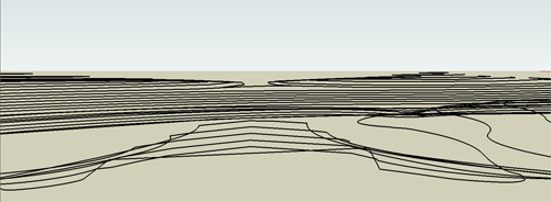
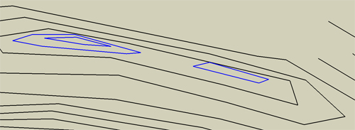
You also may notice problems like I did, where I have a hill top that is supposed to have two peaks.  I made two separate contour loops as seen below (blue are the higher contours).

needtofixvalley

The problem is that SketchUp will simply create topo straight across between the two, as there is nothing pulling the form back down between them.  This can be fixed by quickly adding a line or two that will outline where you want the low point of the pass to be.

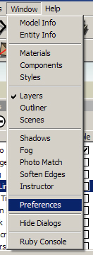
Now its time to have SketchUp do some work.  First open the Window drop down, and select Preferences.

PrefMenu

Then in the left side select “extensions”, and turn on sandbox.

ExtentionMenu

That will add the sandbox toolbar to your display.  ensure that you have all layers off except topo, and that you have the topo layer selected with the radio button, and do a quick save in case the program crashes during the next step.  Now click on the button on the far left of the toolbar- “From Contours”.

sandboxtoolbar

At the bottom left edge of the screen, there will be a progress bar.  Depending on your processor and the size and detail of your model, it may be quick to fill, or take quite a while.  If you notice the bar suddenly stop moving, don’t touch anything.  SketchUp is very touchy, and its likely that your computer is using so much power to create the topo that it doesn’t have enough left to move a —->—- further to the right.  I know, it sounds scary, but in SketchUp, if something starts to freeze up, don’t start clicking, just put the mouse down and go get a sandwich.  If you click you may cause a crash, but if you leave it alone, you have a good chance of the computer catching up with itself and then you can save ASAP. Once its done, turn on shadows to get a little better lighting, and it should look something like this:

newlytopoed

Step 3: That shouldn’t look like that…

Now take a close look at your model.  You should be able to see all on the topo lines you drew, with a surface in between them, but you will likely see some areas that look… off.  Two key things to look for are places where you see to many lines (Red), or topo lines disappear for no reason (Blue).

topoproblems

As you can see with the shadows turned on, missing lines come from an area where SketchUp arbitrarily decided to skip sections of topo lines and take a shortcut.  The extra lines happen when SketchUp forgets how to draw a flat surface in a small area, so it freaks out and starts throwing lines across the area.  Go to the View drop down and turn on “Hidden Geometry”.  You can now see all of the polygons created by the software.

Double click the topography you created, and you’ll notice that the hidden lines now highlight when you mouse over them as you are in component editing mode.  the first topo fixes you are going to do are the quick and easy ones.  You might notice an area where a topo line or two are covered, like this:

needtoturnhidden

Now you are going to use the tool on the far right in the “sandbox” toolbar- “Flip Edge”.  This takes a diagonal line and rotates it to the opposite diagonal.  Here is an animation of flipping the lines, one by one, to correct the topography.

turnani

Note: For some reason I cannot get the GIF to play, even though it does in the wordpress blog text window, so I don’t know what is going on.  Check it out here.

Once you go around and fix all of the areas you can using this method, you will have the more complicated work to do of manually adding and removing polygons, but that will wait for next week.


Tuesday Tutorial Primer: So you want a 3D model…

11 08 2009

The first thing you have to figure out when you want to make a 3D model for a rendering is if you really want a 3D model rendering.  This decision is similar to the question of if you want a hand rendered plan or a Photoshop plan.  There are of course aesthetic reasons involved.  Both can work extremely well, and look amazing, but by understanding your client, your design, and the look you will get from either method of rendering you can make the choice of which is best for you on a given project.

There are more then just aesthetic differences to be looked at, however.  Ask yourself what the purpose of the model is.  Is it for images of a few conceptual designs, or for a final design proposal?  If you are looking to do more of a conceptual design presentation, then you may want to go with a hand drawing, as they are going to be relatively quick and easy, where a 3D model, even using software like SketchUp will be somewhat drawn out and difficult, as a lot of time will be spent re-making the same things multiple times in NEARLY the same way.  One of the reasons to go with a 3D model, in any level of design, is because of the ability to animate the design to increase the understanding of the place by allowing the client to “walk through” the site.  Also, if you think you may want multiple angles of a space, or think the client may want to see a few additional places later on, you may want to make a 3D model, as you can always add additional camera and have a new rendering for the cost of running one of your CPUs for a few hours overnight.  In the final design phase it may be far more worthwhile to create a 3D model as if a little extra time and the right software some pretty amazing images can be created.

Conceptual Hand:

sketchdemo

Conceptual SketchUp:

memorial

Final full 3D Rendering:

3DDemo

The third issue is purely a question of time: is it worthwhile to invest the time into a 3D model, or does it make more sense to do hand sketches.  One of the ways computer models are different from computer plans is that a computer plan is extremely easy to edit, giving itself a big advantage over hand graphics which must always be made from scratch, and many 3D models are difficult if not effectively impossible to edit.  Another time factor is the issue of the current hardware you have in terms of computers.  Go back and check out my post of computer hardware, and see if you have a suitable system for 3D modeling.  It can be done on almost any machine (I can run high end stuff on my 633 Mhz Celeron with 256 or RAM and a 32 Meg TNT graphics card if I’m feeling silly), but some machines will not only render slowly, but will slow down the creation process as well (See: Machine I just mentioned) to the point where you lose any hope of cost effectiveness.

There are some special uses that 3D models suit themselves to much more as well.  If you want to create a new element in an existing location, you can re-sketch the whole scene, or you could create the new element in 3D, and place it into the photo of the existing site.  This can be an extremely effective rendering, and isn’t something that has to take a lot of time to do.  The model for the following image is a fairly simple SketchUp model with careful lighting and camera placement to create the right angle and shadows, but was a very quick project for the quality of the end product.

bluff

In the coming weeks I will take you from a CAD plan to a conceptual model, and then off to higher end software such as Maya and 3D Studio Max for better textures, lighting, and reflections, using my new website as the structure.  For the time being, pick a small simple design you have, and, if you do not already have them, put the design into CAD software.  This CAD basemap will be the basis of our design, so close all your lines, and keep some decent layer organization.  Next week I will address the CAD file you will import into Sketchup, and in the weeks after is when the real fun will begin.